Home Decor, Blog
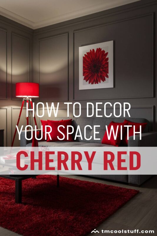
Cherry Coded Home Decor: Elevate Your Space with Rich Reds
Hey there, fellow decor enthusiast! Lately, rich, juicy cherry red has been appearing across fashion and home decor, making its presence impossible to ignore. From accent pillows to statement furniture, this bold hue is having a serious moment. But this isn’t just any color trend – welcome to the “Cherry Coded” revolution that’s set to dominate 2025!
I’ve been absolutely obsessed with this trend since Pinterest officially crowned “Cherry Coded” as THE color of the year. Honestly, I couldn’t be more excited about it. After years of safe beiges and greiges dominating our spaces, we’re finally embracing something with a bit more… oomph!
As interior designer Maya Leclair puts it: “Cherry red is the push we’ve all been needing to break free from playing it safe. It’s like the perfect red lipstick for your home – timeless yet totally of the moment.”
The pandemic also played a role in this color shift. As we spent more time at home, many of us realized how desperately our spaces needed a bit of joy and energy. Cherry red delivers exactly that punch of vibrancy we’ve been craving. It’s optimistic, bold, and unapologetically alive – exactly what we need after some challenging years.
In this guide, I’ll walk you through everything you need to know about incorporating this gorgeous, vibrant shade into your home. Whether you want to go bold with a cherry red sofa or just dip your toe in with some subtle accents, I’ve got you covered. So grab your favorite drink, get comfy, and let’s dive into the deliciously rich world of cherry coded decor!
Don’t forget to check out our deep dive on cherry red to learn more about this trend and discover how to style it if you’re a fan!
Table of Contents
Why We’re Drawn to Cherry Red
Ever wondered why certain colors suddenly grab our collective attention? The psychology behind our attraction to cherry red is actually fascinating! 😃
Red is the color best at attracting our attention. It’s not just my opinion – science backs this up! According to color psychology research, red is associated with energy, passion, and confidence. It literally increases our heart rate and respiration when we see it. In a home setting, this translates to spaces that feel more alive and dynamic.
“The psychology of red is complex and multifaceted,” explains color psychologist Dr. Emma Thompson. “It’s a color that can’t be ignored – it demands attention and creates an immediate emotional response, which is exactly why it works so well as an accent in neutral spaces.” The Psychology of Red
Have you heard about the “unexpected red theory” that’s been all over TikTok? It basically says that adding any amount of red to a room where it doesn’t belong automatically makes the space look more pulled together. While this might sound like social media pseudoscience, there’s actually some truth to it! Red serves as a focal point that draws the eye and creates visual interest, making a space feel more intentionally designed.
Red also has historical associations with power and luxury. For centuries, red dyes were expensive and difficult to produce, making red fabrics a symbol of wealth and status. Perhaps our attraction to cherry red taps into this subconscious association with sophistication and opulence. It feels special in a way that neutrals simply can’t match.
But here’s what I find most interesting – cherry red specifically adds an element of playfulness and joy that pure red sometimes lacks. It’s slightly softer and more approachable, walking that perfect line between making a statement and maintaining warmth. It’s assertive without being intimidating, bold without being harsh. No wonder we’re all falling for it!
Going Bold: Statement Cherry Red Furniture
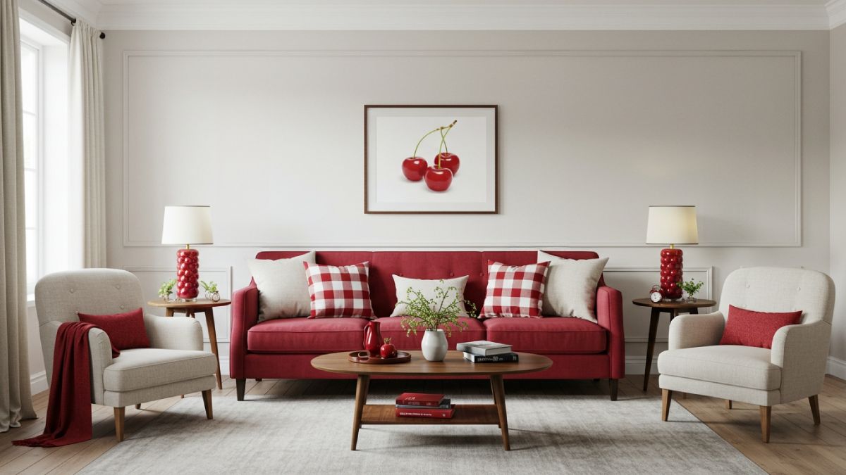
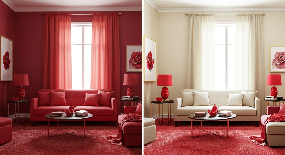
Ready to make a serious cherry coded statement? Let’s talk about the ultimate commitment: red furniture! I know, it sounds intimidating, but trust me – a cherry red sofa or accent chair can absolutely transform your space in the best possible way.
A cherry red velvet sofa in a neutral living room is like the ultimate “wow” moment. It immediately becomes the focal point while somehow making everything around it look more intentional and curated. If you’re worried about it being too much, pair it with lots of neutrals – think cream walls, natural wood, and textural elements like jute or rattan to balance the boldness.
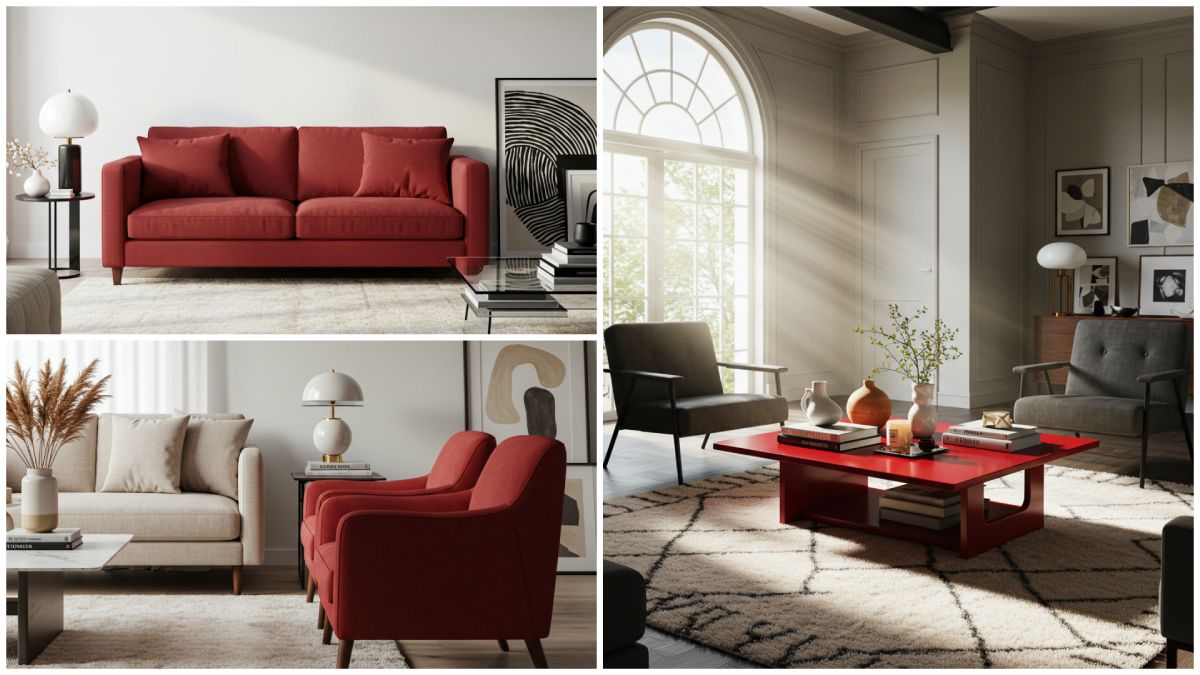
Bold Tip: If you’re hesitant about a large red piece, start with an accent chair. It’s less of a commitment but still makes a strong style statement. Plus, you can easily move it around if you want to refresh your space.
For those of you with a bit more color confidence, try pairing cherry red furniture with complementary colors for an even more dramatic effect. Cherry red and cobalt blue? Absolutely stunning. Cherry red and emerald green? Holiday-inspired but in the most sophisticated way. Cherry red and mustard yellow? Unexpected but gorgeous, especially for fall.
“When selecting cherry red furniture, consider the room’s lighting,” advises interior designer Bethany Adams. “In rooms with lots of natural light, cherry red appears brighter and more vibrant. In spaces with less light, it can look deeper and more dramatic. Both effects can be beautiful – it’s just about what vibe you’re going for.” Homes and Gardens
Remember, quality matters when investing in a statement piece. Look for durable fabrics and solid construction that will stand the test of time. A well-made cherry red sofa can remain the stunning centerpiece of your space for years to come, even as other trends fade. IMO, it’s worth spending a bit more on something that’s going to be the star of your room!
The Art of Cherry Accents: Small Pops of Red
Not ready to commit to a cherry red sofa? No worries! One of the best things about this trend is that even small doses make a big impact. Let’s explore some ways to incorporate cherry red accents that will instantly elevate your space.
Textiles: The Easiest Entry Point
Textiles are the no-commitment way to test out cherry red in your home. Think:
• Throw pillows: A couple of cherry red pillows on a neutral sofa immediately wakes up the room
• Throw blankets: Drape a cherry knit or cashmere throw over your couch or bed for instant warmth
• Table linens: Cherry red napkins or a table runner add a festive touch to dining spaces
• Curtains: For the slightly more adventurous, cherry red curtains frame a window beautifully
What’s great about textiles is that they’re relatively inexpensive and super easy to swap out if you decide the color isn’t for you (though I bet you’ll fall in love with it!).
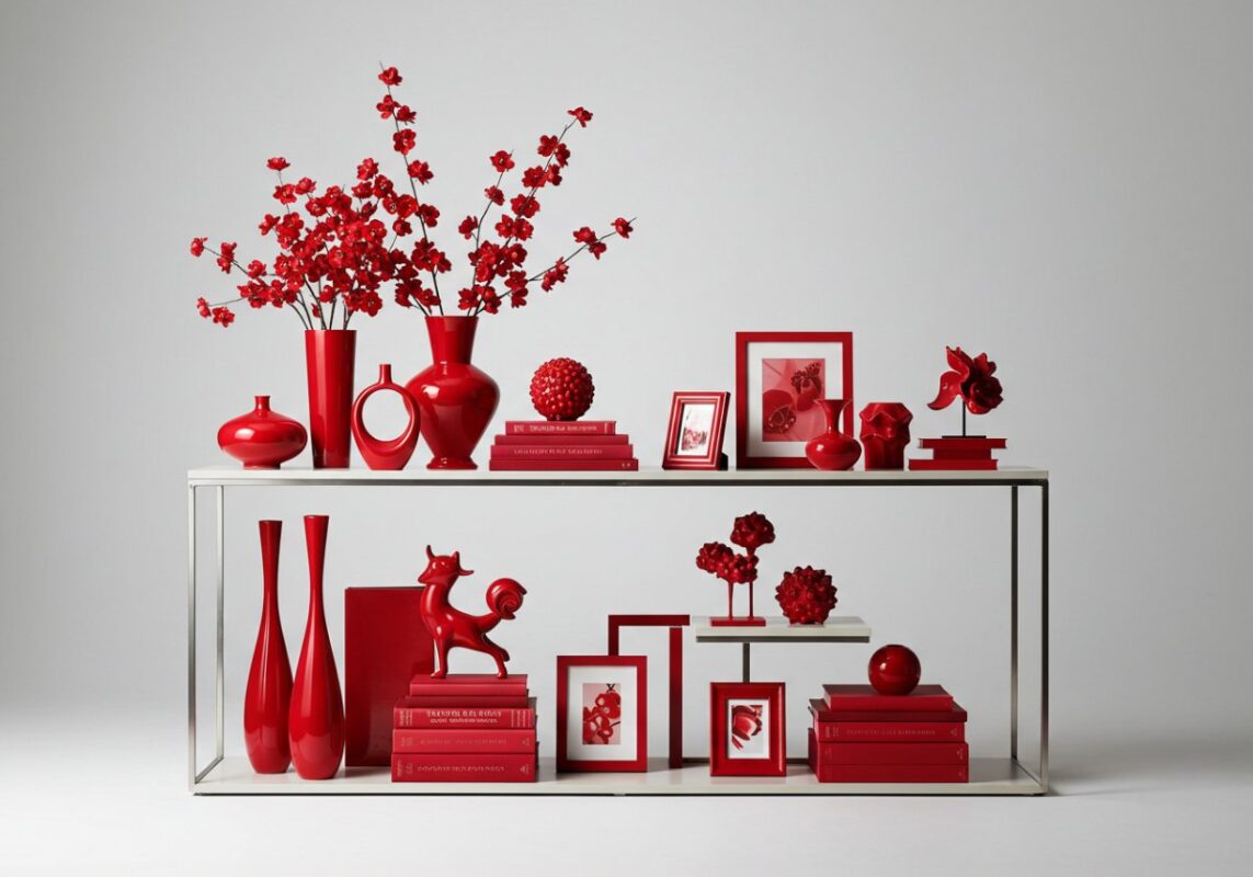
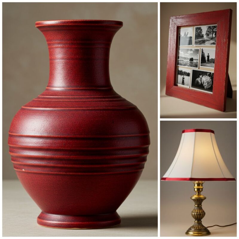
Decor Items That Pack a Punch
Small decorative items in cherry red can have a surprising impact:
• Vases: A cherry red vase filled with white flowers creates a striking contrast
• Books: Red-covered coffee table books make a chic statement
• Picture frames: Frame your favorite photos in cherry red frames for an unexpected pop
• Candles: Red taper candles in brass holders add vintage glamour
Have you heard of the “unexpected red theory”? It’s the idea that a small, surprising pop of red in an otherwise neutral room magically pulls everything together. Try placing a single cherry red decorative object on a bookshelf or coffee table and watch how it instantly gives the space more intentionality!
Lighting That Glows
Cherry red lighting fixtures are having a major moment:
• Table lamps: A cherry red base with a neutral shade strikes the perfect balance
• Pendant lights: A red pendant makes a statement without overwhelming
• Lampshades: Swap out a boring white shade for a cherry red one
“Lighting is an ideal place to introduce cherry red because it literally glows when illuminated, creating a warm, almost magical effect in the evenings,” explains lighting designer James Mitchell. And honestly? There’s something incredibly cozy about the warm glow of a red lampshade in the evening. It creates this incredibly intimate atmosphere that’s perfect for unwinding after a long day.
Cherry Red in Different Rooms: Where It Works Best
Cherry red can work in any room, but it shines differently depending on where you use it. Let’s take a room-by-room tour to see how this vibrant hue can transform different spaces in your home!
Living Room: The Heart of Cherry Coded Style
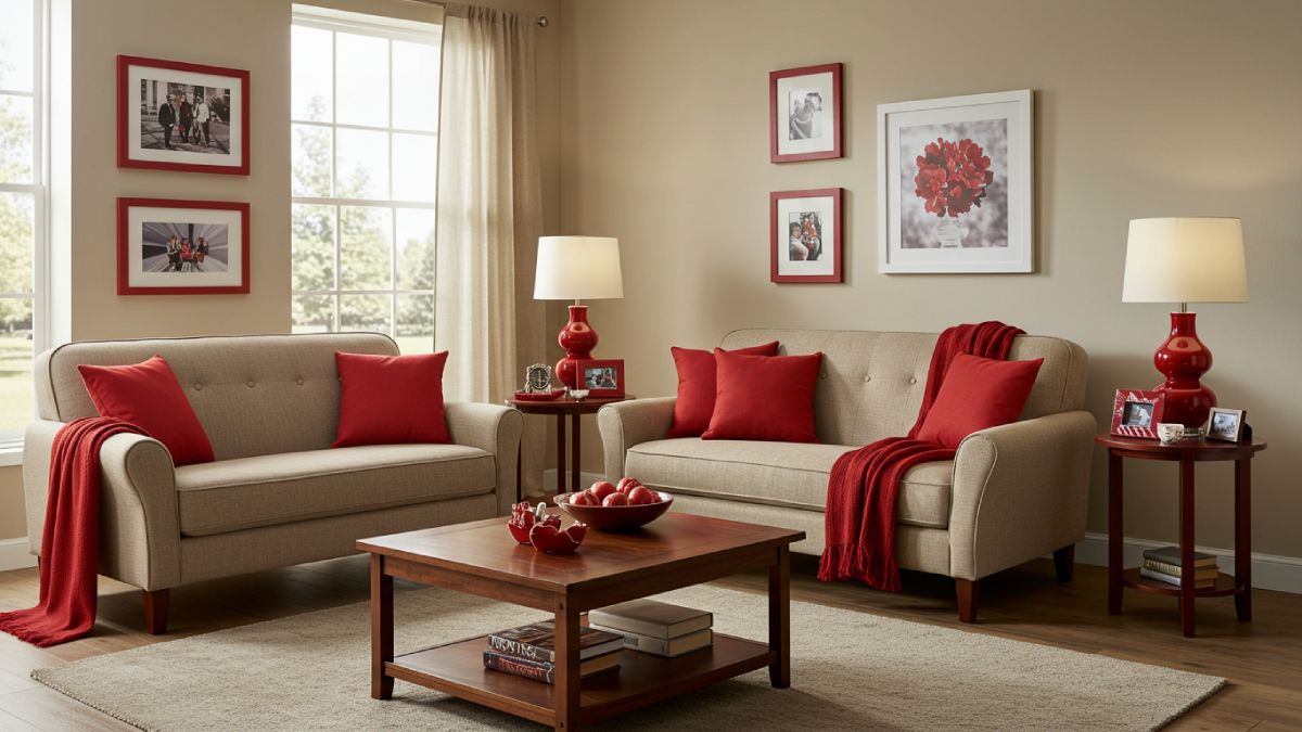
The living room is perhaps the most natural place to introduce cherry red. It’s a social space that benefits from the energy and warmth that red brings. Try:
• A cherry red accent wall behind your TV or fireplace
• Red accent chairs flanking a neutral sofa
• A cluster of red throw pillows in various textures
• A statement red coffee table or side table
My living room hack? Layer different shades and textures of red for a sophisticated look – think a cherry red velvet pillow next to a deeper burgundy knit throw. The subtle variations add depth and keep it from looking flat or one-dimensional.
Kitchen: Spice It Up!
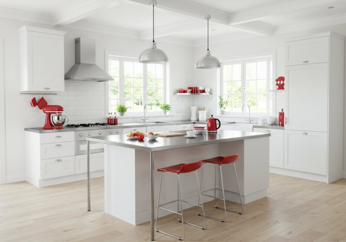
Kitchens and red have a natural affinity – there’s a reason so many classic diners feature this energizing color! Red actually stimulates appetite and encourages conversation, making it perfect for cooking and dining spaces:
• Cherry red small appliances (stand mixers, toasters, coffee makers)
• Red bar stools at a kitchen island
• Red cabinet knobs and drawer pulls
• A red kitchen rug to warm up tile floors
Kitchen Tip: If you’re feeling bold, consider painting a kitchen island cherry red while keeping the perimeter cabinets neutral. It creates a stunning focal point without overwhelming the space.
Bedroom: Romantic Cherry Vibes
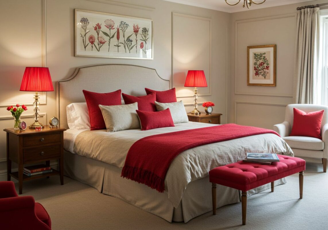
In the bedroom, cherry red brings undeniable romantic energy. It’s passionate and intimate – perfect for creating a cozy sanctuary:
• Cherry red bedding with neutral walls
• A red headboard as a dramatic focal point
• Red accent pillows on an otherwise neutral bed
• Cherry red lampshades for a warm evening glow
“For bedrooms, cherry red is best used as an accent rather than the primary color,” suggests interior designer Katie Schroder. “Too much red can feel overstimulating in a space meant for rest. Think 20% red, 80% calming neutrals for the perfect balance.” Homes and Gardens
Bathroom: Unexpected Luxury
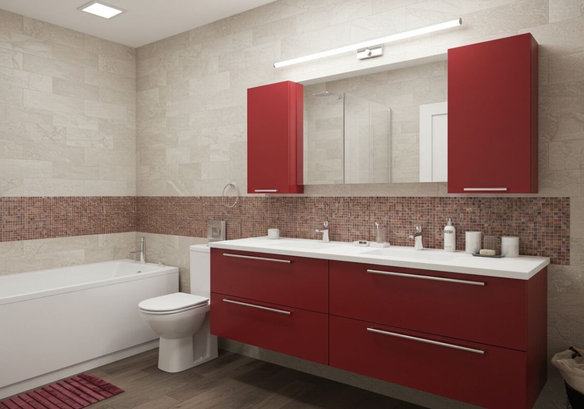
Bathrooms offer a fantastic opportunity to go bold with color, since they’re smaller spaces we don’t spend all day in:
• Cherry red vanity with white countertop and fixtures
• Red bath towels for an easy accent
• A red bathmat against white tiles
• Red framed mirror as a focal point
My bathroom recently got a cherry red makeover with just two elements – hand towels and a soap dispenser – and the transformation was dramatic! It went from forgettable to a space that makes me smile every time I wash my hands. Sometimes it really is the little things!
Perfect Pairings: Colors That Complement Cherry Red
Wondering what colors work best with cherry red? This vibrant hue is surprisingly versatile, but some combinations definitely shine brighter than others. Here’s your guide to perfect cherry red color pairings:
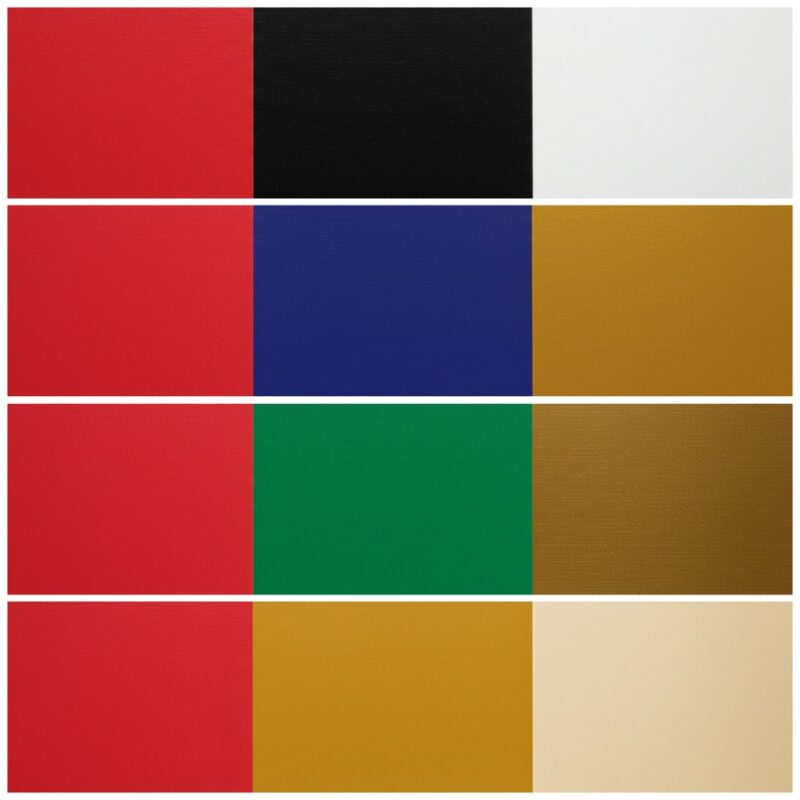
Neutrals + Cherry: Timeless Elegance
When in doubt, pair cherry red with neutrals for a classic, sophisticated look:
• White and cherry red: This high-contrast pairing feels fresh and crisp – think Scandinavian modern
• Black and cherry red: Dramatic and bold, this combo has serious impact
• Beige/cream and cherry red: Softer and warmer than white, creating an inviting atmosphere
• Gray and cherry red: Modern and sleek, especially with cooler blue-grays
“Neutrals act as the perfect canvas for cherry red to shine,” explains interior stylist Alexis Woodbury Earman. “The contrast allows the red to make its statement without competing with other colors.” The Woodbury Home
Bold Colors + Cherry: For the Color Confident
Ready to get adventurous? These unexpected color combinations with cherry red create serious design magic:
• Cobalt blue and cherry red: This combination feels artistic and vibrant
• Emerald green and cherry red: Rich and luxurious, perfect for a maximalist space
• Mustard yellow and cherry red: Warm and energetic with a vintage vibe
• Turquoise and cherry red: Fresh and playful, ideal for a bohemian space
For these bolder combinations, I’d recommend using the 60-30-10 rule: 60% of your primary color (often a neutral), 30% of your secondary color, and 10% of your accent color (which could be your cherry red). This creates balance and prevents the space from feeling chaotic.
Patterns + Cherry: Layered Interest
Don’t be afraid to mix cherry red with patterns for added visual interest:
• Stripes and cherry red: Classic and slightly nautical, especially in black and white
• Florals and cherry red: Romantic and feminine
• Animal prints and cherry red: Unexpected and a bit edgy
• Geometric patterns and cherry red: Modern and graphic
When mixing patterns with cherry red, make sure the pattern incorporates either the cherry red itself or colors that complement it. This creates cohesion and prevents the space from feeling disjointed.
DIY Cherry Coded Projects: Add Red on a Budget
You don’t need to break the bank to bring cherry coded style into your home! Here are some budget-friendly DIY projects that add that perfect pop of red:
Paint Projects With Impact
Paint is your best friend when it comes to affordable transformations:
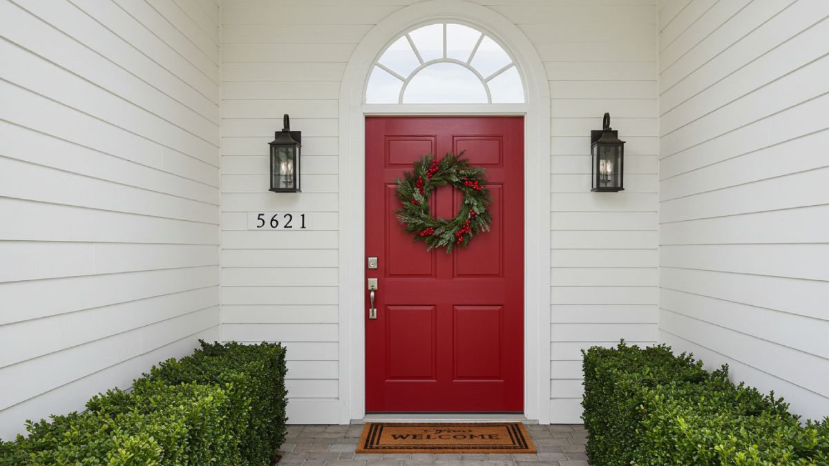
• Painted door: A cherry red door (interior or exterior) makes a huge statement
• Painted furniture: Transform an old side table, chair, or dresser with cherry red paint
• Red bookshelf backs: Paint just the back wall of a bookshelf red for a surprise pop of color
• Picture frame makeover: Spray paint thrifted frames for instant cherry accents
Pro Tip: For furniture, I recommend using chalk paint or a good primer before applying your cherry red. This ensures even coverage and a professional-looking finish, especially when going from a dark color to red.
No-Paint Cherry Updates
Not ready to commit to paint? Try these no-paint cherry red updates:
• Washi tape accents: Use red washi tape to outline picture frames, mirror edges, or even create geometric wall designs
• Contact paper projects: Red contact paper can transform the inside of a cabinet, the back of a bookshelf, or even a tabletop
• Red ribbon embellishments: Add red grosgrain ribbon to the edges of lampshades, curtains, or throw pillows
• Wrapped vases: Wrap empty wine bottles or vases with red yarn or twine for textural accents
My favorite no-commitment cherry red update? I wrapped the cord of a plain pendant light with red fabric cord cover – it took 15 minutes and adds a subtle pop of color that makes me smile every time I see it.
Thrifted Cherry Treasures
Don’t overlook thrift stores, Facebook Marketplace, and estate sales for cherry red finds:
• Vintage cherry red glassware
• Red ceramic planters
• Mid-century red accessories
• Cherry red kitchen tools
The 80s and 90s were big on red, so there are plenty of cherry treasures waiting to be discovered in thrift stores. Just be selective and look for items with classic shapes and good quality materials – not everything from that era deserves a second chance! 😉
The Cherry Refresh: Seasonal Updates for Year-Round Style
One of the best things about cherry red? It works beautifully across all seasons! Here’s how to adapt your cherry coded decor throughout the year:
Spring Cherry: Fresh and Vibrant
In spring, pair cherry red with:
• Fresh floral patterns
• Light neutrals like white and cream
• Pastel accents like mint or sky blue
• Natural elements like rattan and light woods
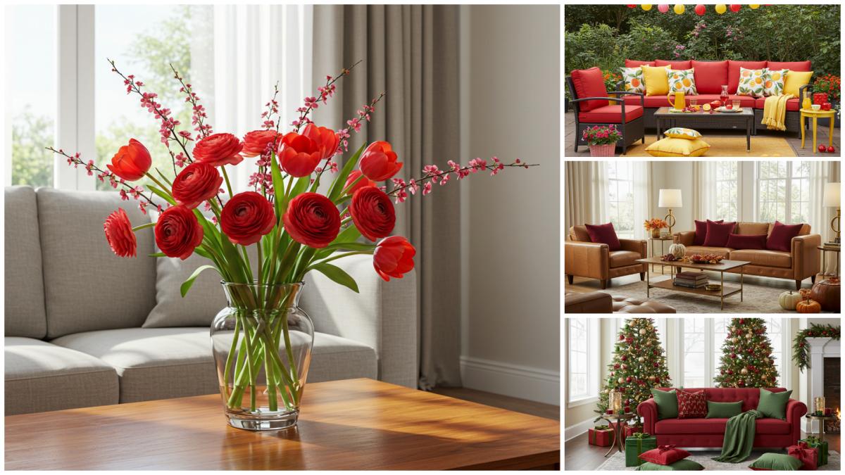
Spring cherry styling idea: Place a cluster of cherry red vases with white spring flowers on a dining table for an eye-catching centerpiece that feels fresh and seasonal.
Summer Cherry: Bold and Playful
For summer, cherry red feels:
• Patriotic when paired with blue and white
• Refreshing with turquoise and aqua
• Tropical with palm prints and natural textures
• Playful with citrus yellows and oranges
Summer cherry hack: Cherry red outdoor pillows on neutral patio furniture instantly make your outdoor space more inviting and festive for summer gatherings.
Fall Cherry: Rich and Cozy
In autumn, cherry red pairs beautifully with:
• Warm neutrals like camel and cognac
• Other rich tones like amber and olive green
• Textural elements like knits and velvets
• Metallic accents in brass and gold
Fall cherry combo I’m obsessed with: Cherry red velvet pillows paired with camel leather furniture and brass accents – absolute autumn perfection that feels cozy yet sophisticated!
Winter Cherry: Festive and Warm
For winter, cherry red becomes:
• Holiday-ready with evergreen and metallics
• Cozy with plaids and warm woods
• Sophisticated with winter whites
• Dramatic with deep navy or black
Winter cherry secret: Instead of traditional Christmas reds that can feel a bit dated, cherry red offers a more sophisticated holiday vibe that transitions well past the new year.
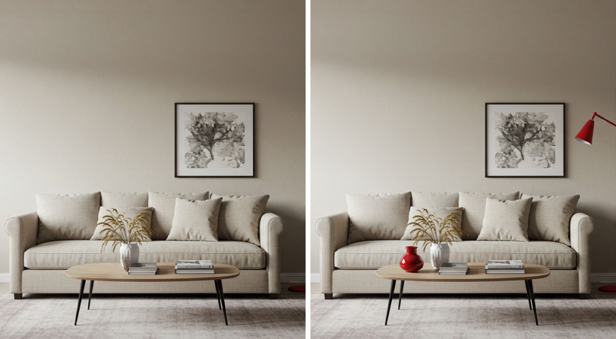
The Unexpected Red Theory: Small Pops with Big Impact
Have you heard about the “unexpected red theory” that’s been blowing up on TikTok and Instagram? This fascinating design concept suggests that adding a small, unexpected pop of red to any space instantly makes it feel more intentional and put-together. And you know what? There’s legitimate psychological research backing this up!
According to Dr. Ingrid Fetell Lee, founder of The Aesthetics of Joy, “Red attracts our attention more readily than other colors. It’s the color best at capturing and holding attention in emotional situations. So when you place a pop of red in an otherwise neutral room, it creates a focal point that helps tie everything together.” Aesthetics of Joy
This theory works because red is literally physiologically stimulating. Studies have found that exposure to red increases blood pressure, respiratory rate, and other measures of arousal. It makes us more alert and more attuned to our surroundings – which is why even a tiny bit of red can have such a massive impact on how we perceive a space.
Ready to try it yourself? Here are some perfect ways to incorporate the unexpected red theory:
• Add a single red book to an otherwise neutral bookshelf
• Place a small red vase or figurine on a coffee table
• Hang a piece of art with a touch of red in an otherwise subdued room
• Swap out one neutral pillow for a cherry red one
• Place a red plant pot among a collection of neutral ones
The key to the unexpected red theory is restraint – it’s about that single, perfect pop of red, not covering your entire space in the color. As designer Taylor Simon (who popularized the theory) says: “The magic happens when the red feels slightly out of place – that’s what creates the tension that makes a room interesting.”
I recently tried this in my own living room by simply adding a small red ceramic bird to my otherwise neutral mantelpiece – and I was shocked by how much more “designed” the entire space suddenly felt! Have you tried this theory in your home? I’d love to hear about it!
Common Mistakes to Avoid with Cherry Red Decor
As much as I love cherry red, I’ll be the first to admit it can be tricky to get right. Let’s talk about some common pitfalls and how to avoid them:
Overusing Red: Finding Balance
The most common mistake? Too much cherry red without enough visual breaks. Remember:
• Red is powerful – a little goes a long way
• Follow the 60-30-10 rule (60% dominant color, 30% secondary color, 10% accent color)
• Create breathing space around your red elements
• Balance red with neutrals for a sophisticated look
“The eye needs places to rest when you’re using a color as vibrant as cherry red,” explains interior designer Katie Schroder. “Without those visual pauses, the space can feel overwhelming rather than energizing.” Atelier Interior Design
Choosing the Wrong Shade of Red
Not all reds are created equal! Cherry red has specific undertones that make it work:
• Cherry red has slight blue undertones (as opposed to orangey-reds like tomato or coral)
• It’s vibrant but has depth – not flat or one-dimensional
• It pairs well with both warm and cool tones
The wrong red can clash with your existing decor or fall flat. If possible, test paint samples or fabric swatches in your space before committing, as lighting dramatically affects how red appears.
Forgetting About Texture
Red is such a strong color visually that it’s easy to forget about texture – but texture is what makes red feel rich rather than flat:
• Incorporate red in different materials (velvet, linen, glass, ceramic)
• Mix matte and glossy red finishes
• Pay attention to the texture of surrounding elements that will balance the red
My texture trick? Pair glossy cherry red accessories with matte neutral surroundings, or vice versa. The contrast adds depth and keeps things interesting!
Neglecting the Room’s Purpose
Not every room calls for the same amount or type of cherry red:
• Energizing spaces like living rooms and kitchens can handle more red
• Relaxing spaces like bedrooms and bathrooms often work better with red as an accent
• Consider how the mood you’re trying to create aligns with red’s energizing properties
I recently made this mistake in my home office – I went too heavy on the cherry red decor and found myself feeling overstimulated during long work sessions. I scaled back to just a red lamp and one red accessory, and the space suddenly felt more conducive to focused work.
Is Cherry Coded Right for Your Home?
At this point, you might be wondering: “Is this trend right for ME?” While I’m obviously a huge fan of cherry red 😕 I recognize it’s not for everyone. Let’s break down how to decide if cherry coded style aligns with your home and personality:
Your Existing Color Palette
Consider your current color scheme:
• Neutrals like white, beige, gray, and black pair beautifully with cherry red
• Blues and greens create stunning contrasts with cherry red
• If your home already features many bright colors, cherry red might compete rather than complement
Pro tip: Look at your wardrobe! If you enjoy wearing red or have red accessories you love, chances are you’ll enjoy living with it too.
Your Design Style
Cherry red can work with many design styles, but it shines especially in:
• Mid-century modern spaces (think cherry red Eames chairs)
• Eclectic and maximalist interiors where bold colors are celebrated
• Modern minimalist spaces where a single red element creates dramatic focus
• Traditional settings paired with rich woods and classic patterns
Cherry red might be more challenging (though not impossible!) in coastal, farmhouse, or very rustic interiors where muted, weathered tones typically dominate.
Your Personality and Lifestyle
Be honest about your color comfort level:
• Do you tend to play it safe or embrace boldness in your choices?
• How frequently do you like to redecorate? (Red is a commitment!)
• Do you prefer energetic or calming environments?
• How do you react emotionally to vibrant colors?
“Cherry red attracts attention and stimulates conversation,” notes design psychologist Dr. Sally Augustine. “If you’re an introvert who craves calm, serene spaces, you might want to use red very sparingly. If you’re more extroverted and energized by vibrant environments, you might embrace it more fully.”
Start Small and Experiment
If you’re unsure, start with low-commitment cherry red elements:
• Throw pillows or a small throw blanket
• A vase or picture frame
• Flowers or plants in red containers
• A single piece of red art
Live with these smaller elements for a while before making bigger investments like furniture or paint. You’ll quickly discover whether cherry red makes you smile every time you see it (as it does for me!) or if it’s not quite your vibe.
Conclusion: Cherry Bomb Your Space with Confidence!
Well, my friend, we’ve covered a lot of ground on our cherry coded journey! From understanding the psychology behind this bold trend to practical ways to incorporate it into every room, you’re now equipped to add this vibrant hue to your space with confidence.
What I love most about cherry red is its versatility. It can be bold and dramatic or subtle and sophisticated. It works across seasons and design styles. And most importantly, it brings energy, warmth, and personality to spaces that might otherwise feel flat or forgettable.
Remember, there are no hard rules in interior design – only guidelines. The most beautiful homes are those that reflect the people who live in them. So if cherry red makes your heart beat a little faster (literally and figuratively!), don’t be afraid to embrace it in ways that feel authentic to you.
Whether you go all-in with a statement cherry red sofa or simply add a single red accessory as a nod to the “unexpected red theory,” I hope this trend brings as much joy to your space as it has to mine. After all, our homes should make us smile – and few things accomplish that as effectively as a perfect pop of cherry red!
So what do you think? Are you ready to get cherry coded? I’d love to hear which ideas resonated most with you or see how you incorporate this vibrant hue into your own space. Here’s to homes that are as bold, vibrant, and full of personality as we are!
Happy decorating! 😃